Post #47
Opera and its Small-Screen Rendering technology
11th November 2003, lunch time | Comments (5)

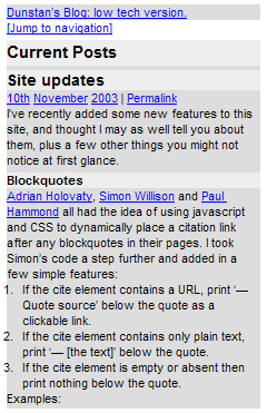
A nice man at Opera just told me about very neat feature in the latest versions of their browser:
The basic idea is to use different stylesheet for different devices. You can see how it works by downloading the latest Windows/Linux version of Opera from and browse to www.opera.com or my.opera.com. Hit SHIFT-F11. On any regular site this will reformat the page to fit the screen width of a mobile phone (using our Small-Screen Rendering technology), but on our own properties we have designed a special handheld stylesheet. If browsing there with the mobile version of Opera, this stylesheet will automatically be used.
This is all part of CSS (just like media screen, print, projection etc), but Opera is the first browser to support it. We are now trying hard to promote it do developers. The additional work needed to create a mobile version is quite limited, especially on sites such as your own with very clean XHTML+CSS code.
Bravo Opera. I’m going to be looking in to the area of web standards support on mobile devices more closely in the coming months, and Opera are helping kick off the project by loaning me a device to test.
New gadgets + Dunstan = Happy Dunstan.
Jump up to the start of the post ↑
Blogmarks
A collection of miscellaneous links that don't merit a main blog posting, but which are interesting none-the-less.
Our enemies are innovative and resourceful, and so are we. They never stop thinking about new ways to harm our country and our people, and neither do we.
— George W Bush (9)- What WordPress is doing to combat comment spam. (1)
- Mobile web tools, from Pukupi. (1)
- Pukupi’s top 10 hints for building interoperable mobile Web sites. (3)
- The photography of E.J. Peiker. (4)
Stuff from the intersection of design, culture and technology.
(3)- Some handy tips for advanced Google use. (35)
- Make your own church signs, or view some real ones. (8)
- Michael Heilemann is doing a great job with his new WordPress theme; Kubrick. (1)
- I’m late to the party, but Dan has a book out. (1)
- What a crazy concept for laying out housing estates. (3)
- In San Francisco, I live here. (Try the zoom feature.) (1)
- Spider-Man reviews crayons. [Via] (3)
- Some beautiful images from photographer Greg Downing. (2)
- Lots of links, from the Link Bunnies. (1)
- Nice “when I was a child” sort of post from Stuart. (1)
- How much does SafariSorter cost? (4)
- Some handy maintenance tips for Mac owners running Panther. (2)
- Alex King launches Use Tasks: a hosted service for Tasks and Tasks Pro™. (2)
- Min Jung, Anil Dash, and I get interviewed for HBO’s Real Sex. (10)
Blog-roll
A selection of blogs I read on a regular basis.
- Hmm, the blog-roll seems to be a little bit broken right now (it may be that the blo.gs service is having problems). I’ve sent myself an email about this problem, and will try to fix it ASAP.