Post #306
Flexible floats
26th March 2004, mid-afternoon | Comments (36)
| Status | |
|---|---|
| Code usage | No longer in use on this blog |
| Updates | Available |
| Demo | Available |
| Downloads | Available |
In my newly styled reading section I’m using das wundervoll float model to maximise the use of space on the page. I’m quite pleased with the result, so I thought I’d share how I’ve done it.
(It's worth pointing out here that I no longer use this code on the reading page, but you can see it in action on a demo page. It's worth taking a look there if you get confused.)
The basic layout
Each book/author and its accompanying information is laid out using a definition list. These <dl>s are each given a fixed width (in pixels) and floated left, so they wrap around to form rows and columns.

When the window is wide
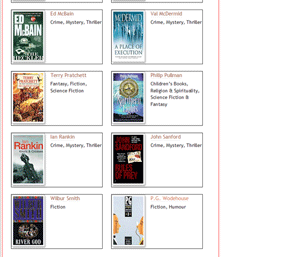
When the browser window is nice and wide, the width of the main content div, div#left (shown below with a red border), is sufficient to let these floated <dl>s (shown below with black borders) wrap two or more to a line.

<dl>s wrap around, two to a line
When the window is narrow
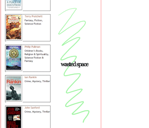
But when the browser window narrows, (and div#left with it), these floated <dl>s ‘unwrap’ and sit one to a line.

<dl>s onto separate lines
Wasted space
The only problem is that when the floated <dl>s unwrap, there’s an awful lot of wasted space on the right hand side of div#left.

There’s plenty of content to fill that white space (look at the amount of text in the Phillip Pullman entry), but it’s unable to spread out. Why? Because it’s contained within the fixed-width <dl>s.
Wouldn’t it be nice if there was a way of saying to the page, Excuse me, have you seen all that white space over there? It’s just that if you
<dl>s would stop being fixed width for a bit, relax, and spread out across the page, things would look a lot nicer.
Now, how would you do that?…
From fixed to liquid
Enter Stuart Langridge, and his Big Book Of Doing Things In Javascript:

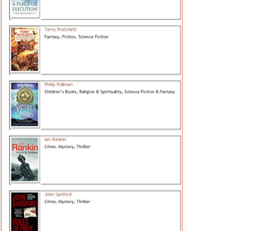
<dl>s resize to take advantage of the white space
Javascript, oh lovely Javascript, you are the solution to all my problems, come here and let me hug you…
How the Javascript actually works
Put simply, the script checks the width of div#left and asks itself: “is div#left wide enough to allow two 150px-wide <dl>s, plus padding and margins, to float side-by-side?”
If the answer is Yes, then the <dl>s are set to width: 150px, and they wrap around, two to a line.
If the answer is No, then the <dl>s are set to the-width-of-div#left-minus-150px, and sit one to a line. (Using the width of div#left as a starting point ensures that the <dl>s will never overflow their container.)
This way there will never be unused white space; both wide and narrow screens (and everything in between) are provided for.
Neat, eh?
Here’s the Javascript code:
// Event Listener// by Scott Andrew - http://scottandrew.com/function addEvent(obj, evType, fn){if (obj.addEventListener){obj.addEventListener(evType, fn, false);return true;}else if (obj.attachEvent){var r = obj.attachEvent('on'+evType, fn);return r;}else{return false;}}// from your man at http://www.kryogenix.org/addEvent(window, "load", resizeBooks);addEvent(window, "resize", resizeBooks);function resizeBooks(e){// check this browser can cope with what we want to doif (!document.getElementById) return;var bd = document.getElementById('rec-books-lists');if (!bd) return;var ad = document.getElementById('rec-authors-lists');if (!ad) return;var lf = document.getElementById('left');if (!lf) return;if (!lf.offsetWidth) return;cnbd = bd.childNodes;cnad = ad.childNodes;// if div#left is wide enough to accept two or more floated <dl>sif (lf.offsetWidth >= 621){// loop through all the dls in div#rec-books-lists and resize them to 150pxfor (var i=0;i<cnbd.length;i++){if (cnbd[i].nodeName.toLowerCase() == 'dl'){cnbd[i].style.width = '150px';}}// loop through all the dls in div#rec-authors-lists and resize them to 150pxfor (var i=0;i<cnad.length;i++){if (cnad[i].nodeName.toLowerCase() == 'dl'){cnad[i].style.width = '150px';}}}// if div#left is too narrow to accept two or more floated <dl>selse{// loop through all the dls in div#rec-books-lists and resize them to the-width-of-div#left-minus-150pxfor (var i=0;i<cnbd.length;i++){if (cnbd[i].nodeName.toLowerCase() == 'dl'){cnbd[i].style.width = (lf.offsetWidth - 150) + 'px';}}// loop through all the dls in div#rec-authors-lists and resize them to the-width-of-div#left-minus-150pxfor (var i=0;i<cnad.length;i++){if (cnad[i].nodeName.toLowerCase() == 'dl'){cnad[i].style.width = (lf.offsetWidth - 150) + 'px';}}}}- Download this code: 306a.txt
Browser issues
The only blot on the landscape here is that some browsers (Opera and Safari 1.0.2) become confused at the idea of absolutely positioning an element within a floated container, consequently this sort of thing happens:

To get around this I’ve had to mess with the CSS and introduce a couple of annoying extra rules. Firstly I code everything as normal, so IE gets the nice layout. Then I remove the float using a Child combinator so Opera displays the page in an acceptable format, and then finally I use an Attribute selector to re-re-set the float for FireFox.
Bit of a laugh, eh?
Here’s some of the CSS, to illustrate that:
/* lay everything out for browsers like IE */body#reading dl {border-bottom: 1px solid #ddd;float: left;height: 170px;margin: 0 25px 20px 0;padding: 0 0 0 113px;position: relative;width: 150px;}body#reading dl dd div {background: url('/blog/commonpics/bg_image.gif') no-repeat bottom right;left: 5px;position: absolute;top: 5px;}/* reset float for Opera */html > body#reading dl {float: none;}/* reset float for FF */html[xmlns] body#reading dl {float: left;}- Download this code: 306b.txt
And there you have it. If you find any browser bugs, then please let me know.
Thanks to Stuart for writing the initial Javascript code, and to Marc Blessington, Rimantas Liubertas and Douglas Bowman for trying to help with the Opera issue.
Jump up to the start of the post ↑
Blogmarks
A collection of miscellaneous links that don't merit a main blog posting, but which are interesting none-the-less.
Our enemies are innovative and resourceful, and so are we. They never stop thinking about new ways to harm our country and our people, and neither do we.
— George W Bush (9)- What WordPress is doing to combat comment spam. (1)
- Mobile web tools, from Pukupi. (1)
- Pukupi’s top 10 hints for building interoperable mobile Web sites. (3)
- The photography of E.J. Peiker. (4)
Stuff from the intersection of design, culture and technology.
(3)- Some handy tips for advanced Google use. (35)
- Make your own church signs, or view some real ones. (8)
- Michael Heilemann is doing a great job with his new WordPress theme; Kubrick. (1)
- I’m late to the party, but Dan has a book out. (1)
- What a crazy concept for laying out housing estates. (3)
- In San Francisco, I live here. (Try the zoom feature.) (1)
- Spider-Man reviews crayons. [Via] (3)
- Some beautiful images from photographer Greg Downing. (2)
- Lots of links, from the Link Bunnies. (1)
- Nice “when I was a child” sort of post from Stuart. (1)
- How much does SafariSorter cost? (4)
- Some handy maintenance tips for Mac owners running Panther. (2)
- Alex King launches Use Tasks: a hosted service for Tasks and Tasks Pro™. (2)
- Min Jung, Anil Dash, and I get interviewed for HBO’s Real Sex. (10)
Blog-roll
A selection of blogs I read on a regular basis.
- Hmm, the blog-roll seems to be a little bit broken right now (it may be that the blo.gs service is having problems). I’ve sent myself an email about this problem, and will try to fix it ASAP.