Post #49
Easy CSS drop shadows
14th November 2003, lunch time | Comments (65)
| Status | |
|---|---|
| Code usage | No longer in use on this blog |
| Updates | Available |
| Demo | Available |
| Downloads | Available |
A few people have noticed that the drop shadows I use[d] on images here aren’t part of the pictures themselves, but are added on through the web equivalent of Magic Fairy Dust — CSS. I thought I’d explain how it’s done in case anyone else wanted to know.
I have two different implementations of this technique: one is for images that are used for decorating a post; one is for images that are used to illustrate a post. Both can be seen in the demo.
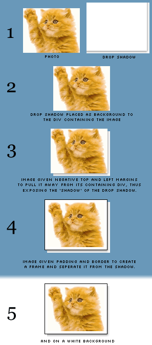
Now then, before we look at the code, have a nose at this picture; it should give you an overview of what actually happens. (I’ve used a blue background so you can see what’s what, and only swapped to a white background at the end for the full effect.)

The mark-up
This is the code to insert into your web pages.
For decorative images
<div class="img-dec"><img src="cat.gif" width="260" height="200" alt="A stupid waving cat" /></div>- Download this code: 49a.txt
For illustrative images
<div class="img-ilus" style="width: 270px;"><img src="cat.gif" width="260" height="200" alt="A stupid waving cat" /></div>- Download this code: 49b.txt
The drop shadow image
Rather than spend ages trying to describe how I made the drop shadow, I’ll just provide the Photoshop file and GIF files for you to download, and you can see for yourself.
You’ll notice that the image is actually pretty big, at 800×800 pixels. I originally started off with a much smaller file, planning never to display images above 300×200 pixels on my blog, but I soon found that I out grew this limit, and the drop shadow gif just wasn’t large enough. So, knowing that such a simple image is actually pretty small in terms of file size (the 800×800 version I use now is only 3.47KB) I thought I’d save myself future hassle and produce a larger-than-I'll-ever-need version.
Drop shadows for different coloured sites
My drop shadow is made using a white background, because that’s the colour of my site. If you find that you need yours to sit on top of lots of different colours (maybe you have a style-switcher on your site), then you could always set a transparent background and save the image as a PNG instead. (Be sure to check the current browser support for this though.)
The CSS
Pop these rules into your style sheet.
For decorative images
div.img-dec {background: url('shadow.gif') no-repeat bottom right;clear: right;float: right;margin: 0 0 15px 25px;padding: 0;position: relative;}div.img-dec img {background-color: #fff;border: 1px solid #a9a9a9;display: block;margin: -5px 5px 5px -5px;padding: 4px;position: relative;}- Download this code: 49c.txt
For illustrative images
div.img-ilus {background: url('shadow.gif') no-repeat bottom right;margin: 10px 5px;padding: 0;position: relative;}div.img-ilus img {background-color: #fff;border: 1px solid #a9a9a9;margin: -5px 5px 5px -5px;padding: 4px;position: relative;vertical-align: bottom;}- Download this code: 49d.txt
And that’s it. It should be pretty easy to get that up and running on your own site, just make sure the CSS paths to the shadow image are correct. Good luck!
Update: Thanks to Susanne Jaeger for helping me get this working in all three major browsers after Tony pointed out a bug.
Alternative methods
2003/11/14: I see that both Chris Hester and Tom Gilder have come up with their own solutions (very nice too), but while theirs rely on adding in six empty <div>s, this technique doesn’t require any additional markup, and that’s what I was aiming for.
2004/03/30: Sergio Villarreal has extended this technique (albeit by using extra markup) in an article on A List Apart. Phil Baines then took Sergio’s code and simplified it. It's worth taking a look at both of their explanations.
Jump up to the start of the post ↑
Blogmarks
A collection of miscellaneous links that don't merit a main blog posting, but which are interesting none-the-less.
Our enemies are innovative and resourceful, and so are we. They never stop thinking about new ways to harm our country and our people, and neither do we.
— George W Bush (9)- What WordPress is doing to combat comment spam. (1)
- Mobile web tools, from Pukupi. (1)
- Pukupi’s top 10 hints for building interoperable mobile Web sites. (3)
- The photography of E.J. Peiker. (4)
Stuff from the intersection of design, culture and technology.
(3)- Some handy tips for advanced Google use. (35)
- Make your own church signs, or view some real ones. (8)
- Michael Heilemann is doing a great job with his new WordPress theme; Kubrick. (1)
- I’m late to the party, but Dan has a book out. (1)
- What a crazy concept for laying out housing estates. (3)
- In San Francisco, I live here. (Try the zoom feature.) (1)
- Spider-Man reviews crayons. [Via] (3)
- Some beautiful images from photographer Greg Downing. (2)
- Lots of links, from the Link Bunnies. (1)
- Nice “when I was a child” sort of post from Stuart. (1)
- How much does SafariSorter cost? (4)
- Some handy maintenance tips for Mac owners running Panther. (2)
- Alex King launches Use Tasks: a hosted service for Tasks and Tasks Pro™. (2)
- Min Jung, Anil Dash, and I get interviewed for HBO’s Real Sex. (10)
Blog-roll
A selection of blogs I read on a regular basis.
- Hmm, the blog-roll seems to be a little bit broken right now (it may be that the blo.gs service is having problems). I’ve sent myself an email about this problem, and will try to fix it ASAP.