Post #433
Version 2
17th July 2004, the wee hours | Comments (96)
I remember hearing Sir Peter Ustinov explain that the making of the film ‘Spartacus’ took so long, that his first child, conceived during filming, was able to answer a school-mate’s question of, What does your father do?
with the reply, Spartacus.
The reason I bring this up is that if you asked The Girlfriend what I do for a living, she’ll only know to reply The Blog
. I think I’ve been working on it for more than half the time we’ve been seeing each other, and its redesign has rather taken over our lives.
Most of the last 40-some days have followed one of two patterns. Either:
- 9am: get out of bed
- Walk to kitchen
- Turn on the computer
- Start work
- Nineteen hours later at 4am: realise the time
- Realise I forgot to eat
- Realise I forgot to wash
- Realise I forgot to move
- Walk to bedroom
- Go to bed
Or:
- 9am: get out of bed
- Get washed
- Walk to cafe
- Turn on the computer
- Start work
- 8pm: cafe closes
- Walk home
- Go to kitchen
- Turn on the computer
- Continue work
- Four hours later at 4am: realise the time
- Walk to bedroom
- Go to bed
And throughout all this, the GF has been heroic; she’s hardly seen me, has put up with my constantly wandering mind, and has always managed to sound interested as I explained the intricacies of learning to parse XML feeds in Python and PHP.
What a gal.
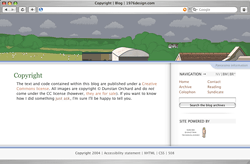
Having said all that, the redesign still isn’t complete: there’s most of the backend still to rewrite; IE’s CSS tomfoolery to take into account; a few Javascript widgets to fix or create; and one very large project which I can’t tell you about just now. (Ooh, the mystery of it all). But we can’t go on like this forever, so, despite all its faults, the redesign is getting launched today. Tweaks and enhancements will follow over the coming weeks.
So, what’s new?
I’ll write a detailed account of each step of the process in the coming weeks, outlining the What and the How of everything here, but for now here's a quick overview.
Better XHTML
I’ve managed to lose quite a few divs; use lists where there were previously just paragraphs with separating-pipes; and re-code the comments to use definition lists, as opposed to headings and paragraphs. All in all it’s a tighter, more semantic site.
Split CSS
Following a lead from Doug, I’ve decided to split my CSS into several files; one for colours and images, and one for layout. I’ve also organised the files by tag type, rather than by what they represent, which has let me identify redundant code and make several sweeping cuts to my CSS. I may go a step further and split out my font styles into a sperate sheet as well.
More weather information
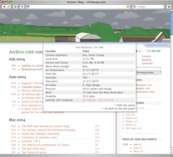
I’m now pulling in weather information for San Francisco as well as Dorset. I completely rewrote my PHP scripts to do this, transforming them from a loose collection of functions into a leaner and neatly packaged weather-fetching class.
On top of the information that weather.com feeds me, I’m also calculating wind chill and apparent temperature, then using them to display a ‘feels like’ temperature when appropriate. The calculation for apparent temperature is a little involved. Here it is:
// Heat Index, or Apparent Temperature// calculated when temperature exceeds 80 degrees F, and when the relative humidity is at least 40%// temperature in fahrenheit$t = $array_data['cc'][0]['tmp'];// relative humidity$rh = round($array_data['cc'][0]['hmid']);// if the conditions are correctif (($t > 80) && ($rh >= 40)){// apparent temperature in fahrenheit$at_far = round(16.93 + (1.85212 * pow(10, -1) * $t) + (5.37941 * $rh) - (1.00254 * pow(10, -1) * $t * $rh) + (9.41695 * pow(10, -3) * pow($t, 2)) + (7.28898 * pow(10, -3) * pow($rh, 2)) + (3.45372 * pow(10, -4) * pow($t, 2) * $rh) - (8.14971 * pow(10, -4) * $t * pow($rh, 2)) + (1.02102 * pow(10, -5) * pow($t, 2) * pow($rh, 2)) - (3.8646 * pow(10, -5) * pow($t, 3)) +(2.91583 * pow(10, -5) * pow($rh, 3)) + (1.42721 * pow(10, -6) * pow($t, 3) * $rh) + (1.97483 * pow(10, -7) * $t * pow($rh, 3)) - (2.18429 * pow(10, -8) * pow($t, 3) * pow($rh, 2)) + (8.43296 * pow(10, -10) * pow($t, 2) * pow($rh, 3)) - (4.81975 * pow(10, -11) * pow($t, 3) * pow($rh, 3)));// apparent temperature in celsius$at_cel = round(((5/9) * ($at_far - 32)), 1);}- Download this code: 433a.txt
Bit of a laugh, eh?
Drop-downs
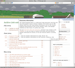
The new weather information is now displayed as a set of drop-down panels that slide in from behind the panorama. Those without the benefit of Javascript will see the information displayed in the right hand column, as a set of tables.
Tabbed navigation
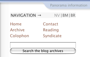
The little tabs have gone, and in their place is a neater, less obtrusive set of links. Some might say too unobtrusive, but there we are; we’ll have to see if it works or not. I’ve been using them for a while now and like their out-of-the-way feel.
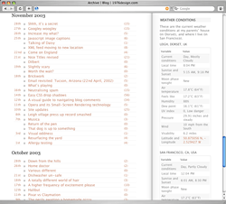
Archive layout
The archive has retained the general look and feel, but I’m making use of display: block and position: absolute to produce a sort of tabular layout, and ensure each link has a large clickable and hoverable area.
Every date is a link
With the exception of the blank days in the calendar, every bit of every date you’ll see on the site is now clickable. It seems people were trying to click on headings that contained dates, and getting frustrated at the lack of linkage. That’s fixed now.
Post times
When I make a post to my blog, I enter two different post times: one for UTC, and one for the local time where ever I happen to be. By recording both timestamps I’m able to ensure that the logical order of posts it preserved (by using the UTC timestamp) while still providing relevant local datetime information. In this case I’m using the local post time to display a more human timestamp than normal:

Comment times
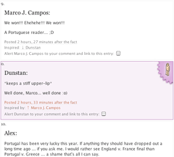
I’ve altered the popular PHP timesince() function to accept another, optional, date variable. When I include this second variable the function works out the time that’s passed between the two dates, not between the current time and a single date. This allows me to display the time that has passed between me posting a blog entry, and a comment being made on that blog entry:
Comment relationships
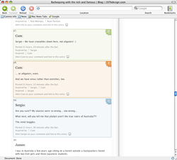
The styles that indicate a comment in focus, and its child, and parent comments, have been updated. They now have a background colour, as well as a little icon to help you pick them out among the mass of information. I’ve also included a style for comments I’ve made, to stop any confusion should someone decide to spoof me.
(By the way, I’m well aware that this whole area is rife with problems, and it’s one of the first things I’ll be fixing when I get a moment.)
The panoramas
I’ve produced a page that displays all the panoramas, for those who are interested. It takes a while for them to download, but if you’ve wondered what they all look like, then it’s worth a peek. You can access it via the Colophon.
Contact page
The contact form uses the same style as the comment form now. So if you’ve left a comment before, you get one style, with all your details filled in; and if you’re a newbie, you get another, more explanatory form.
Reading
The reading page has a new twist on the flexible floats script, which I’ll explain at a later date.
Demos, downloads, and updates
I’ve moved coding demos out from the posts that explain them, and into a demo sub-domain. Any post that deals with coding examples now has a little ‘coding information’ blurb at the start of it, which explains the status of the code, and links to any updates, demos, or downloads. For an example take a look at the drop shadows post.
From fluid to fixed layout
I decided to move to a fixed layout for two reasons: firstly because I’ve had enough of dealing with fluid-width layout problems, and fancied tackling a new set of issues; and secondly because I want to start using larger images in my posts, and knowing that I have a fixed-width container lets me do that without fear of breaking the layout.
I did wonder what would happen if I ever redesigned again and these large images were too large for the new design. I put the brain to work, and came up with the solution below.
Code and image inserts
All my code examples and images are now inserted into the database as simple, one line, homegrown XML tags. These tags are parsed on-the-fly, with the correct image or code example being plucked from the server, formatted according to my current needs, and then displayed in the post as requested. This means that I’ll never have to edit a post again to take into account a new design or a rethink of the way I present these elements; all I need do is alter one PHP file, and everything will change. I’ll be explaining this in a lot more detail later on.
// to insert a section of code (this section in fact)<codeins="433b" />// to insert a image<imageins="433e" alt="A screen shot showing a comment's post time" caption="Comments display their post time as ‘time after the fact’" class="" link="large" linktitle="" />- Download this code: 433b.txt
Commentators
I’ve had the commentators page running privately for a while now, and have been waiting for a piece of Javascript to be written before I put it live, but the Javascript is never going to appear, so I’m giving in, and releasing it as it is. Basically it’s a page that lets you see who’s commented on this site, and what they said.
It’s not perfect for two reasons: one, not everyone uses unique names when posting a comment (there could be more than one guy called ‘Ethan’, for example); and two, I still haven’t figured out how to deal with certain characters in my system, so names like “Mathieu ‘P01’ HENRI” break the system. (And actually, the same goes for the Blogged People list. “Tantek Çelik” breaks that every time, damn him.)
PNGs
I’ve gone a little alpha-transparency crazy here, but I rather like it. The vertical dividing line was originally a spine shadow from a copy of National Geographic, before I recreated it in Photoshop and changed it into a PNG. The shadows on the header and footer, as well as the ‘Panorama information’ tab and the dropdowns it triggers, are also PNGs. I especially like the way they slide over each other as the browser resizes.
IE people get no shadows on the header, footer, dropdowns, or information tab, but do get a GIF version of the spine shadow to help the structure of the page.
Oh, and as before, the graphics for the header and footer change colour depending on the time of day, only this time the panorama information tab joins in. Blues for day time, greys for night.
Blogroll
This is possibly the neatest bit of the whole redesign. Using a combination of homegrown PHP and Python scripts, some help from Stuart Langridge and Simon Willison, and a combination of Mark Pilgrim’s Fetch Anything, and Ultra Liberal Feed Parser scripts, I’ve managed to grab and display the title of the last post each site on my blogroll published.
Now, when my blogroll tells me a site has been updated, I’m able to tell which post I’ll see if I click through to the site. If it’s one I know I’ve already read then there’s no need to click.
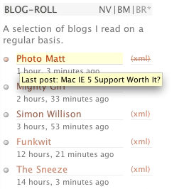
I’m also indicating if the XML feeds the sites publish are invalid, and if so, what the errors are:
All three bits of information (the title, the validity, and the error) can be accessed as title tooltips. To see a post title, just hover over the names of any of the sites which have an XML feed. And if you want to see the invalid feed error, hover over Photo Matt’s XML feed link. (I’ve also visually styled the invalid feed links to indicate an error, although I might change that to something slightly different.)
What’s broken?
Hmm, well, it’s not a short list, I’ll tell you that much, but the main buggy areas are to deal with: the comment highlighting in all browsers; various JS widgets not working in Safari; insane layout issues in IE; and the dropdown menus not functioning 100% in Opera. So, please consider this a site under public development, not a finished product.
As I said before, I’ll endeavour to write up each of the points above in more details over the next few weeks. In the meantime, take a look around the site, break what you can, and let me know what you think.
Jump up to the start of the post ↑
Blogmarks
A collection of miscellaneous links that don't merit a main blog posting, but which are interesting none-the-less.
Our enemies are innovative and resourceful, and so are we. They never stop thinking about new ways to harm our country and our people, and neither do we.
— George W Bush (9)- What WordPress is doing to combat comment spam. (1)
- Mobile web tools, from Pukupi. (1)
- Pukupi’s top 10 hints for building interoperable mobile Web sites. (3)
- The photography of E.J. Peiker. (4)
Stuff from the intersection of design, culture and technology.
(3)- Some handy tips for advanced Google use. (35)
- Make your own church signs, or view some real ones. (8)
- Michael Heilemann is doing a great job with his new WordPress theme; Kubrick. (1)
- I’m late to the party, but Dan has a book out. (1)
- What a crazy concept for laying out housing estates. (3)
- In San Francisco, I live here. (Try the zoom feature.) (1)
- Spider-Man reviews crayons. [Via] (3)
- Some beautiful images from photographer Greg Downing. (2)
- Lots of links, from the Link Bunnies. (1)
- Nice “when I was a child” sort of post from Stuart. (1)
- How much does SafariSorter cost? (4)
- Some handy maintenance tips for Mac owners running Panther. (2)
- Alex King launches Use Tasks: a hosted service for Tasks and Tasks Pro™. (2)
- Min Jung, Anil Dash, and I get interviewed for HBO’s Real Sex. (10)
Blog-roll
A selection of blogs I read on a regular basis.
- Hmm, the blog-roll seems to be a little bit broken right now (it may be that the blo.gs service is having problems). I’ve sent myself an email about this problem, and will try to fix it ASAP.
