Post #485
You are currently only viewing posts within the category: Site news
You are here: Home → Archive → Site news → 2004 → September → 7th → this post
Link presentation and Fitts' Law
7th September 2004, lunch time | Comments (24)
A few weeks ago Dave Shea posted an article about Fitts’ Law, which states that:
The time to acquire a target is a function of the distance to and size of the target.
This means that the larger the target, and the shorter the distance you have to move to get to that target, the quicker it’ll be to acquire.
Dave had taken that idea into account when producing his latest site design, and it’s something that I tried to incorporate into my recent work as well.
Beautiful big links
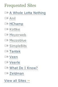
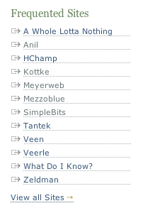
One thing I’ve grown used to when browsing my blog is the idea that I don’t always have to directly mouse over linked text in order to interact with a link. For an example of what I mean, run your mouse down the list of links in the right-hand column of this page. Regardless of the length of text contained in the link, the actual <a> spans the full width of the column.
This image should demonstrate that:
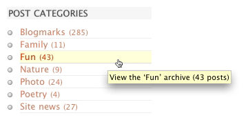
This approach not only makes the physical act of selecting links easier, but it also allows me to hover over a link without obscuring the text it contains (and as an additional perk the horizontal lines provide a nice, structured, visual effect).
So by applying a few simple CSS rules I’m rewarded with four benefits:
- quicker and easier link selection;
- the ability to hover over a link without obscuring the text it contains;
- the visual separation of each link from the many others that surround it;
- and finally, the subtle addition of visual structure to the whole page.
What are these simple CSS rules?
The CSS needed to get this kind of thing working is easy as pie. Here’s a simplified example of the code I use to style my right-hand column menus:
ul li a {border-bottom: 1px solid #eee;display: block;text-decoration: none;width: 190px;}- Download this code: 485a.txt
A real-world example
I thought it might be helpful for you to see some kind of real-world before-and-after example of this technique. Herr Bowman just happened to be logged on to iChat while I was writing this post, so after getting his permission I put together two simple animations to demonstrate how things would look and behave if he switched to using this technique in his sidebar.
Before
On the left is Doug’s original sidebar. On the right I’ve highlighted the target area of each link, in yellow. If you click on the image you can view an animation of this menu being moused over.
The above graphic should illustrate that each link’s target area only covers the enclosed text, and nothing more; so if you want to select a link, or hover over it to get the title popup, you’re going to have to aim fairly carefully, move the mouse around a bit, and also cover-up the text with your cursor.
After
Here’s an altered version of the sidebar, where the links have had border-bottom: 1px dotted #adb0b8; display: block; text-decoration: none; width: 152px; applied to them. Again, I’ve altered the image so you can see that the target area for each link, and you should notice that these areas are much greater than in the first example. (As before, click on the image to view an animation of the menu being moused over.)
While the aesthetics will come down to personal taste, there’s no doubting that as Fitts’ Law goes, this second menu is more effective than Doug’s original version. That’s not to say that Doug made a mistake, or that his menu is ineffective (far from it), just that this second version was built with a different focus in mind than the original.
What we don’t want
Having said that increasing a link’s target area is a good thing, I should add in a caveat: it’s only a good thing if that’s what the user expects.
Occasionally I come across a site that uses display: block; width: ##px; for links, but which fails to convey the extra large target area in an obvious manner. I’ll be moving my mouse through some apparently unclaimed whitespace when suddenly, and much to my surprise, a link:hover activates. It’s not whoops-there-go-my-underpants surprising, but it’s the sort of thing that makes a user stop and wonder what happened; and as designers I’d suggest that’s something we should be avoiding.
Why designers make this mistake
The normal visual clue a user looks for to determine the extent of a link (i.e. its clickable area) is either an underline, an enclosing box, or some kind of background color.
Most sidebar links will just use an underline (text-decoration: underline;), but unfortunately the underline doesn’t play well with this presentation technique.
To demonstrate this fact, I’ve put a screen shot below. Both links have display: block; width: 200px; applied, but while the first one uses the default underline (text-decoration: underline;) the second has had a bottom border applied to it instead (border-bottom: 1px solid #111; text-decoration: none;):
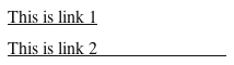
I’ve then highlighted the clickable area for each link in yellow:
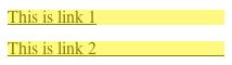
You can see the clickable areas are exactly the same size, but while the second one has a visual clue as to the scope of this area, the first one gives us no hint at all. Designers who don’t understand this issue but who still use display: block; width: ##px; run the risk of confusing their users.
Doug’s not a wally
Like everything else on his site, Doug’s choice not to use this technique in his sidebars was no doubt carefully thought out, and I’m in no way suggesting he’s wrong to not use it (he does in fact use it in his primary navigation, just not his sidebar navigation). What I am saying is that I like the benefits it brings to my blog, and that I noticeably miss it whenever I visit someone else’s site.
Use it, or don’t use it, the choice is obviously yours, I just thought I’d jot down a few thoughts on the matter for those who aren’t aware of the technique. I hope someone finds it useful.
Jump up to the start of the post ↑
Blogmarks
A collection of miscellaneous links that don't merit a main blog posting, but which are interesting none-the-less.
Our enemies are innovative and resourceful, and so are we. They never stop thinking about new ways to harm our country and our people, and neither do we.
— George W Bush (9)- What WordPress is doing to combat comment spam. (1)
- Mobile web tools, from Pukupi. (1)
- Pukupi’s top 10 hints for building interoperable mobile Web sites. (3)
- The photography of E.J. Peiker. (4)
Stuff from the intersection of design, culture and technology.
(3)- Some handy tips for advanced Google use. (35)
- Make your own church signs, or view some real ones. (8)
- Michael Heilemann is doing a great job with his new WordPress theme; Kubrick. (1)
- I’m late to the party, but Dan has a book out. (1)
- What a crazy concept for laying out housing estates. (3)
- In San Francisco, I live here. (Try the zoom feature.) (1)
- Spider-Man reviews crayons. [Via] (3)
- Some beautiful images from photographer Greg Downing. (2)
- Lots of links, from the Link Bunnies. (1)
- Nice “when I was a child” sort of post from Stuart. (1)
- How much does SafariSorter cost? (4)
- Some handy maintenance tips for Mac owners running Panther. (2)
- Alex King launches Use Tasks: a hosted service for Tasks and Tasks Pro™. (2)
- Min Jung, Anil Dash, and I get interviewed for HBO’s Real Sex. (10)
Blog-roll
A selection of blogs I read on a regular basis.
- Hmm, the blog-roll seems to be a little bit broken right now (it may be that the blo.gs service is having problems). I’ve sent myself an email about this problem, and will try to fix it ASAP.