Post #49

You are currently only viewing posts within the category: Site news
You are here: HomeArchiveSite news2003November14th → this post

Easy CSS drop shadows

14th November 2003, lunch time | Comments (65)

Code information
Status
Code usage No longer in use on this blog
Updates Available
Demo Available
Downloads Available

A few people have noticed that the drop shadows I use[d] on images here aren’t part of the pictures themselves, but are added on through the web equivalent of Magic Fairy Dust — CSS. I thought I’d explain how it’s done in case anyone else wanted to know.

I have two different implementations of this technique: one is for images that are used for decorating a post; one is for images that are used to illustrate a post. Both can be seen in the demo.

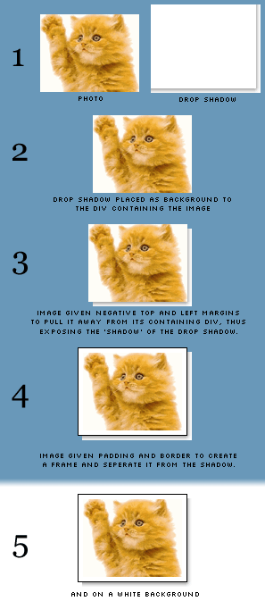
Now then, before we look at the code, have a nose at this picture; it should give you an overview of what actually happens. (I’ve used a blue background so you can see what’s what, and only swapped to a white background at the end for the full effect.)

Graphical overview of this technique

The mark-up

This is the code to insert into your web pages.

For decorative images

  1. <div class="img-dec"><img src="cat.gif" width="260" height="200" alt="A stupid waving cat" /></div>
  2. Download this code: 49a.txt

For illustrative images

  1. <div class="img-ilus" style="width: 270px;"><img src="cat.gif" width="260" height="200" alt="A stupid waving cat" /></div>
  2. Download this code: 49b.txt

The drop shadow image

Rather than spend ages trying to describe how I made the drop shadow, I’ll just provide the Photoshop file and GIF files for you to download, and you can see for yourself.

You’ll notice that the image is actually pretty big, at 800×800 pixels. I originally started off with a much smaller file, planning never to display images above 300×200 pixels on my blog, but I soon found that I out grew this limit, and the drop shadow gif just wasn’t large enough. So, knowing that such a simple image is actually pretty small in terms of file size (the 800×800 version I use now is only 3.47KB) I thought I’d save myself future hassle and produce a larger-than-I'll-ever-need version.

Drop shadows for different coloured sites

My drop shadow is made using a white background, because that’s the colour of my site. If you find that you need yours to sit on top of lots of different colours (maybe you have a style-switcher on your site), then you could always set a transparent background and save the image as a PNG instead. (Be sure to check the current browser support for this though.)

The CSS

Pop these rules into your style sheet.

For decorative images

  1. div.img-dec {
  2. background: url('shadow.gif') no-repeat bottom right;
  3. clear: right;
  4. float: right;
  5. margin: 0 0 15px 25px;
  6. padding: 0;
  7. position: relative;
  8. }
  9.  
  10. div.img-dec img {
  11. background-color: #fff;
  12. border: 1px solid #a9a9a9;
  13. display: block;
  14. margin: -5px 5px 5px -5px;
  15. padding: 4px;
  16. position: relative;
  17. }
  18. Download this code: 49c.txt

For illustrative images

  1. div.img-ilus {
  2. background: url('shadow.gif') no-repeat bottom right;
  3. margin: 10px 5px;
  4. padding: 0;
  5. position: relative;
  6. }
  7.  
  8. div.img-ilus img {
  9. background-color: #fff;
  10. border: 1px solid #a9a9a9;
  11. margin: -5px 5px 5px -5px;
  12. padding: 4px;
  13. position: relative;
  14. vertical-align: bottom;
  15. }
  16. Download this code: 49d.txt

And that’s it. It should be pretty easy to get that up and running on your own site, just make sure the CSS paths to the shadow image are correct. Good luck!

Update: Thanks to Susanne Jaeger for helping me get this working in all three major browsers after Tony pointed out a bug.

Alternative methods

2003/11/14: I see that both Chris Hester and Tom Gilder have come up with their own solutions (very nice too), but while theirs rely on adding in six empty <div>s, this technique doesn’t require any additional markup, and that’s what I was aiming for.

2004/03/30: Sergio Villarreal has extended this technique (albeit by using extra markup) in an article on A List Apart. Phil Baines then took Sergio’s code and simplified it. It's worth taking a look at both of their explanations.

Jump up to the start of the post


Comments (65)

Jump down to the comment form ↓

  1. Tony Crockford:

    Nice effect, thought you'd like to know that Opera7.22 doesn't quite get it, preferring to leave off the bottom of the shadow for some reason.

    Doncha just love the way different browsers do CSS?

    ;o)

    Posted 10 hours, 17 minutes after the fact
    Inspired: ↓ Dunstan, ↓ Dunstan
  2. Dunstan:

    It's an odd problem actually Tony, I'm sure it's Moz that gets this wrong, but I've gone with the code I posted above because at least this way Opera and IE display something that still looks OK.

    If I alter my CSS so Opera and IE work then Moz sticks a 5px space between the image and the shadow, and it looks very wrong.

    Until I can figure it out this was the lesser of two evils.

    But thanks for pointing it out, you got me off my bum and asking for help on CSS-d :o)

    Posted 11 hours, 47 minutes after the fact
    Inspired by: ↑ Tony Crockford
    Inspired: ↓ Dunstan
  3. Pushkar:

    Great tip! Thanks!

    Posted 1 day, 2 hours after the fact
  4. Mini-d:

    Why you don't set background-img to an image directly? I think it's better than write a div and then insert an image.

    Something like this:

    img.lol {
    background-img: xxx;
    padding: 0px 5px 5px 0px;
    }

    I've tryed this before and it worked well...

    Posted 1 day, 3 hours after the fact
    Inspired: ↓ Dunstan, ↓ Tim
  5. Dunstan:

    Ah, with some help from CCS-d (Susanne Jaeger http://www.sujag.de/) I have it working.

    I'm going to alter the code listed above so it works in all three browsers now.

    Susanne writes:

    I think it's a variant of the old 'img as only inline-content' problem.
    http://devedge.netscape.com/viewsource/2002/img-table/

    Posted 1 day, 3 hours after the fact
    Inspired by: ↑ Tony Crockford, ↑ Dunstan
    Inspired: ↓ Jayme
  6. Dunstan:

    Mini-d writes: "Why you don't set background-img to an image directly?"

    Two reasons:

    [1] Images have to be contained by a block-level element anyway, so I already have to wrap them in a 'p' or 'div'.

    [2] Doing it your way works fine until you want to add a border (as well as padding) to the image. Then the border appears on the outside of the drop shadow, which ruins the effect.

    Posted 1 day, 3 hours after the fact
    Inspired by: ↑ Mini-d
  7. Mash:

    style="width: 260px; w\idth: 270px"
    IE5... argghh :)

    Posted 2 days, 7 hours after the fact
    Inspired: ↓ Dunstan
  8. Mash:

    I mean BMH
    style="width: 260px; w_ReverseSolidus_idth: 270px"

    Posted 2 days, 7 hours after the fact
    Inspired: ↓ Dunstan
  9. Dunstan:

    Err, I _think_ what you're trying to say is that I should have included a CSS hack for IE5's box-model problems.

    Yes, I should have.

    Bad Dunstan.

    Posted 2 days, 7 hours after the fact
    Inspired by: ↑ Mash, ↑ Mash
    Inspired: ↓ Mash, ↓ Dunstan
  10. Mash:

    "argghh" - because many people still use IE5. I hate it.

    Maybe you shouldn't.
    Good Dunstan. :)

    Posted 2 days, 9 hours after the fact
    Inspired by: ↑ Dunstan
  11. Markku:

    Dunstan, this is a really nice trick. I think I'll use this on my site soon. :)

    Posted 2 days, 11 hours after the fact
    Inspired: ↓ Dunstan
  12. Dunstan:

    Hey Markku,

    The only problem (as Mash points out) is that browsers that get the box model wrong have an 8px gap between the image and the shadow on the right hand side.

    Doesn't seem to be anything you can do about this since the width of the containing div is specified inline (and you don't seem to be able to do do BM hacks inline).

    The only way I can see around this is:

    [1] Say 'bugger you' to those browsers.
    [2] Have all your images the same width, and specify the containing div width in the style sheet (where you can use the BM hack).
    [3] Invent an inline version of the BM hack.

    Good luck!

    Posted 2 days, 23 hours after the fact
    Inspired by: ↑ Dunstan, ↑ Markku
  13. Steven:

    I'm using IE. When i view the drop shadow examples on this page everything looks great.

    I'm just having a problem with the padding around the inside image. When i use the style everything works except the padding round the inside image.

    Why?

    Posted 3 days, 21 hours after the fact
    Inspired: ↓ Dunstan
  14. Dunstan:

    Steven - I know it works fine in IE6, but that IE5x messes up because it doesn't get the box model right.

    Email me the IE version you're using and a screen shot and I'll see if I can help you out.

    Posted 4 days after the fact
    Inspired by: ↑ Steven
    Inspired: ↓ Steven
  15. Steven:

    where is your email address?
    i'm thick.

    Posted 4 days, 4 hours after the fact
    Inspired by: ↑ Dunstan
    Inspired: ↓ Dunstan
  16. Dunstan:

    It's on the 'Contact' page! :op

    http://www.1976design.com/blog/contact/

    Posted 4 days, 4 hours after the fact
    Inspired by: ↑ Steven
  17. Tim:

    Mini-d,

    I tried this div-less method (see http://cgi.timandkathy.co.uk/blog/archives/computing_internet/being_jakob_neilsen.php ) and couldn't get the top and left clearance that it needs to become realistic-looking.

    Did you have any more luck than I did?

    Posted 4 days, 5 hours after the fact
    Inspired by: ↑ Mini-d
  18. Richard:

    I ran into a problem in IE6 that if the start of the text (for the decorative image setup) ran on straight after the close DIV ([/DIV]Hello World), then the left-padding was applied to the first line of this text. I got round this by changing everything to use SPAN instead of DIV.

    Posted 1 week after the fact
    Inspired: ↓ Dunstan
  19. Dunstan:

    Hey Richard... hmm, well, OK, but remember that images have to be enclosed by a block-level element, and span isn't block-level, it's inline. Watch out for that if you're going to validate your pages (and of course you are, right?)

    Posted 1 week after the fact
    Inspired by: ↑ Richard
  20. Richard Rutter:

    I've implemented a similar version of this on Clagnut - same look - slightly different code. Because of the latout methods I am using, I couldn't use the negative margin trick, so I relatively positioned the img instead. Worked nicely. I also use an alpha-transparent shadow (which doesn't show up at all in IE/Win - if I could be bothered I could use a CSS hack or more likely a server-side technique to serve IE/Win with a gif instead) so that the background will show through nicely.

    One of the disadvantages of trying to do anything like this with CSS, specifically, wanting the containing block to shrink to the width of its content, is that block level elements are always sized to fill the width of their container. The only way around it is to float the block or give it a width to match the image.

    Posted 3 weeks, 3 days after the fact
    Inspired: ↓ Dunstan
  21. Dunstan:

    I've thought about using a png as well and just using a '>' selector in CSS to feed a gif to IE and PNG to Moz and the rest:

    // for IE
    #content div.img-dec {
    background: url(shadow.gif) bottom right no-repeat;
    }

    // for Moz, Opera, etc
    #content > div.img-dec {
    background: url(shadow.png) bottom right no-repeat;
    }

    But as I only have a white background I didn't see the point in this case.

    "The only way around it is to float the block or give it a width to match the image."

    Yeah, that's a pain - it's easy enough to grab the image width using PHP and slip in the necessary CSS on the fly, but it would be easier if that didn't have to happen. Roll on CSS3 and drop shadows...

    You got a link to an example on your site? I couldn't find one :o/

    Posted 3 weeks, 3 days after the fact
    Inspired by: ↑ Richard Rutter
    Inspired: ↓ Richard Rutter
  22. Richard Rutter:

    > You got a link to an example on your site? I couldn't find one

    I've got two types of examples. In this post
    http://www.clagnut.com/blog/264/
    click the 'window' link in the third paragraph and an image should 'popup' over what you're reading. Click again to remove it. (What do you think about that idea? I like it but it seems 'wrong'.)

    A more straight forward image-in-post example is here:
    http://www.clagnut.com/blog/244/

    Posted 3 weeks, 3 days after the fact
    Inspired by: ↑ Dunstan
    Inspired: ↓ Dunstan
  23. Dunstan:

    Rich, that popup idea is very cool!

    It feels 'wrong' to me as well though, I feel like I want windows architecture around it. I wonder if a more prominant, darker border might solve the issues we both obviously have with it?

    At the moment it's too much 'part of the background' to my mind. I wonder if a better border would help seperate it from the underlying content?

    But it is very cool, an excellent way of presenting images to quckly illustrate something. Good thinking, sir :o)

    And the simpler version, yes, it looks identical to mine (or mine to yours). Well done us :o)

    p.s. I'm not going to your site any more, those sidebars drive me mad with envy!

    Posted 3 weeks, 3 days after the fact
    Inspired by: ↑ Richard Rutter
    Inspired: ↓ Richard Rutter
  24. Richard Rutter:

    > At the moment it's too much 'part of the background' to my
    > mind. I wonder if a better border would help seperate it
    > from the underlying content?

    Yeah, you could be right. I wanted a fairly subtle effect, but maybe this is too subtle. Not quite sure how to improve it yet...

    > And the simpler version, yes, it looks identical to mine (or mine > to yours). Well done us :o)

    They look like yours. Although, I didn't spot this explanatory post until after I had implemented them.

    > p.s. I'm not going to your site any more, those sidebars drive me > mad with envy!

    Just use the RSS feed like the rest of the world then :-)

    Posted 3 weeks, 3 days after the fact
    Inspired by: ↑ Dunstan
    Inspired: ↓ Dunstan
  25. Dunstan:

    "They look like yours. Although, I didn't spot this explanatory post until after I had implemented them."

    Oh yes, I wasn't implying anything there!

    Posted 3 weeks, 3 days after the fact
    Inspired by: ↑ Richard Rutter
  26. Bkw:

    Lovely method, and much better than the (technically disgusting) tables I've been using.

    One problem I have, is that I can not figure out a graceful way to center an image with the drop shadow in place ... except for nesting the <div class="img_dec"> inside another <div style="text-align: center"> ... which is, again, technically disgusting.

    I'd be curious to see if anyone has any thoughts on this.

    cheers,
    -ben

    Posted 1 month, 1 week after the fact
  27. Simplefix:

    ok
    i understand the point of using css to add this drop shadow. And that all of u want to feel speacial by doing so , and then write about it in blogs so u can make ur point and see if any1 else thinks, ur as speacial as 'u think' u are for 'coding' valid css.

    BUT Y NOT JUST DO IT ALL IN PHOTOSHOP THEN U WONT HAVE TO CODE SHIT...LMFAO AHAHAHAHAHAHAHHH

    Posted 1 month, 1 week after the fact
    Inspired: ↓ Dunstan
  28. Idiot1:

    this site sucks in IE6.

    I mean thenames of peoplpe that have posted comments are overlapping the order of the comments itself.

    Posted 1 month, 1 week after the fact
    Inspired: ↓ Dunstan
  29. Dunstan:

    "BUT Y NOT JUST DO IT ALL IN PHOTOSHOP THEN U WONT HAVE TO CODE SHIT...LMFAO AHAHAHAHAHAHAHHH"

    Why? Because, Mr Simplefix, the adding of drop shadows to images within Photoshop is hugely limiting.

    You can't resize the image without the drop shadows resizing; you can't alter the background colour of your site without having to alter every single image you ever made; you can't use the single image you uploaded for many different purposes, because it'll always have a shadow stuck on it; people will be downloading drop shadow data for each image they view on your site (rather than one, cached image when using CSS); and finally, if you ever change your mind about using drop shadows on your site, you'd have to edit every image you ever uploaded.

    It's actually pretty obvious.

    Adding drop shadows in Photoshop is kind of the same as adding in presentation markup in your web pages - you 'corrupt' your data with presentational elements.

    So, rather than laughing your 'flipping' arse off, why don't you think about the future of a given site, think about the nature of the information being stored, and think about leaving your name and contact details when you leave a comment like that instead of being a cowardly prick.

    Thanks for writing :o)

    Posted 1 month, 1 week after the fact
    Inspired by: ↑ Simplefix
  30. Dunstan:

    Yup, it has to be fixed.
    Thank you for your continued support.
    I'll try and send you a 'Friends of Dunstan' badge or something.

    Posted 1 month, 1 week after the fact
    Inspired by: ↑ Idiot1
  31. Tony C:

    Dunstan,

    Thanks for the excellent write-up on your use of CSS for drop shadows.

    I love your explanation to Simplefix on why this is a vastly superior way to adopt drop shadows, rather than creating them by hand in Photoshop. I couldn't even imagine the chore of adding/removing drop shadowns on hundreds of images, when simply wrapping a div around the image does the trick just fine.

    I do wonder, though, does writing like this:

    "...so u can make ur point and see if any1 else thinks, ur as speacial as 'u think' u are..."

    make one feel "special", or are some people just lazy? Has the English language been hijacked? Hmmm...

    Posted 1 month, 2 weeks after the fact
  32. Jayme:

    Great effect Dunstan. Your shadow effects render fine in my IE and Moz, but my shadow effects get screwed up in Moz. I modified the CSS a bit to get them floating left or right, but I don't see what's wrong. Here it is:

    .img-shadow-tl, .img-shadow-tr {
    background-image: url(/images/shadow.gif);
    background-position: bottom right;
    background-repeat: no-repeat;
    padding: 0px;
    position: relative;
    }
    .img-shadow-tl {
    margin: 10px 10px 5px 0px;
    clear: left;
    float: left;
    }
    .img-shadow-tr {
    margin: 10px 0px 5px 10px;
    clear: right;
    float: right;
    }
    .img-shadow-tl img, .img-shadow-tr img, {
    background-color: #fff;
    border: 1px solid #000;
    margin: -5px 5px 5px -5px;
    display: block;
    padding: 2px;
    position: relative;
    }

    The page I'm experimenting with is http://www.jaymekohler.com/index_new.htm. Any suggestions?

    Jayme

    Posted 1 month, 3 weeks after the fact
    Inspired by: ↑ Dunstan
  33. Chris Hester:

    Thanks for the link. The problem I see with your approach is that the shadows are cut cleanly at the bottom left and top right edges. To me this looks wrong, hence my smoother approach. There should be some pixels to fade the edges away, like a real shadow. Otherwise, nice work!

    Posted 1 month, 4 weeks after the fact
    Inspired: ↓ Dunstan
  34. Dunstan:

    That's true Chris, and yes, it's a shame that happens. But the lack of extra mark-up means it's a trade-off I'm happy with. Horses for courses and all that :o)

    Thanks for stopping by, and for your comment.

    Posted 1 month, 4 weeks after the fact
    Inspired by: ↑ Chris Hester
  35. Doesnt Work:

    Hi, I tried this example, exactly as it is specified here. But it doesn't work neither on IE nor on mozilla. Your site looks ok though. I have no idea how come the drop shadow thing doesn't work in my site, but it is as if you wake up one day and everbody else seem to be acting weird. I have no idea how come your site works but mine doesn't. I know I can figure it out after spending 2-3 hours, but I just don't know. I wrote this just to report that, there is definitely something that makes this thing not work in certain cases. Btw, just for the record, I am extremely good at these stuff, so I am not a newbie. Just to make sure that you take my notice seriously and in case others report the similar stories, someday this issue may be resolved.

    Posted 2 months, 2 weeks after the fact
  36. Laurent Angeli:

    hi,

    thanks for this method which i found it is great !
    Just one question :
    Can you explain me what is the differences between an illustrative image and a decorative one ?
    It is not very clear for me :)
    Thanks in advance !

    Laurent

    Posted 2 months, 2 weeks after the fact
    Inspired: ↓ Dunstan
  37. Karl Bedingfield:

    Hi Dunstun,

    This really is great :)

    When using the illustrative class do you always have to specify an additional 10px in the 'style="width: 270px;'?

    So if my image is 160px w I would use 170px for the 'style="width:'

    Thanks
    Karl

    Posted 2 months, 2 weeks after the fact
    Inspired: ↓ Dunstan
  38. Dunstan:

    Laurent, the only difference is that a decorative image floats off to the right, and is really there only to add decoration to the post. An illustrative image sits on the left and disrupts the flow of text (it's 'display: block') - it's there to illustrate a point or technique.

    Those are just my distinctions, but the style difference is that one is floated right, and one is displayed block on the left.

    Posted 2 months, 2 weeks after the fact
    Inspired by: ↑ Laurent Angeli
  39. Dunstan:

    Karl, that's right. And the reason it's 10px is that there is 4px of padding and 1px of margin on either side of the image:

    1px + 4px + image width + 4px + 1px = image width + 10px

    So that's how wide your containing div has to be.
    If you change the padding or border then you'll have to alter your div width.

    Posted 2 months, 2 weeks after the fact
    Inspired by: ↑ Karl Bedingfield
  40. Oliver:

    I modified this a bit so I can add captions. Well, there are some drawbacks: it's questionable if that is semantically correct (well, I think it ain't), and it relies on the BMH (not necessarily, though), and I needed to add an extra <div>. But still, I thought I'd like to share.

    Here's my CSS:

    div.newsimg {
    background: url(/images/dropshadow.gif) bottom right no-repeat;
    float: right;
    margin: 10px 5px;
    padding: 0;
    text-align:center;
    font-size:xx-small;width:300px;
    font-size:xx-small;voice-family:""}"";voice-family:inherit;
    font-size:x-small;width:310px;
    }
    html>body .newsimg{font-size:x-small;width:310px;}

    div.newsimg div {position: relative;top:-5px;left:-5px;border: 1px solid #a9a9a9;}

    div.newsimg img {
    background-color: #fff;
    margin: 4px;
    }

    And here's the HTML:

    <div class="newsimg">
    <div><img src="/images/your-image-here.jpg" alt="alternate text here">
    <p>Caption goes here</p>
    </div>
    </div>

    It workes for me on IE 5, Mozilla (1.2.1) and Opera (7.23).

    Posted 3 months after the fact
  41. Lee:

    Dunst, just a quick note to say cheers, must have come after the glithes were ironed out, works fine in IE 5-6 and Moz for me and looks greate (better than the pure CSS drop shadows I saw).

    Using it on a new site I'm working on (see link).

    Thanks again, greate effect.

    Lee

    Posted 3 months after the fact
  42. Amir:

    The problem with this method, is that you can't add a Drop shadow to a centered picture without defining a width to the div. Or am I wrong?

    Posted 3 months, 2 weeks after the fact
    Inspired: ↓ Dunstan, ↓ Jennie
  43. Dunstan:

    No, you're right, that's not possible with my simple method.

    But see here:
    http://www.alistapart.com/articles/cssdropshadows/

    Posted 3 months, 2 weeks after the fact
    Inspired by: ↑ Amir
  44. Amir:

    Dunstan, ALA's article deals too only with floated divs. No solution for a centered picture...

    Posted 3 months, 2 weeks after the fact
    Inspired: ↓ Dunstan
  45. Dunstan:

    Oh, well then you're buggered. Sorry! :o)

    Posted 3 months, 2 weeks after the fact
    Inspired by: ↑ Amir
  46. Anthony:

    Hello thanks for this great idea. It works great. I only have one problem I was wondering if somebody could help with. If I'm using the illustrative method...how could I get 2 images to display inline. If I change it to display:inline...the shadow is gone in IE and cut off in Firebird. Any ideas how to display to images next to one another without using a table.

    Posted 3 months, 3 weeks after the fact
    Inspired: ↓ Dunstan
  47. Dunstan:

    Check out my (messy) CSS file, and a post like this one:
    http://1976design.com/blog/archive/2004/02/27/snow-torchlight/

    The style you're interested in is called 'img-gal'.

    That should hopefully do what you want.

    Posted 3 months, 3 weeks after the fact
    Inspired by: ↑ Anthony
  48. Mailman:

    Thanks Dunstan, this is a great example of CSS usage. You know there is always people sitting in the dark, hiding to just jump on a chance to give their negative point on everything....those fall in the category "You don't like it! walk away"

    Great job!(excuse my writting, English is like my fifth language) keep smiling, it's free and contagious :)

    Posted 4 months, 1 week after the fact
  49. Mcdowell:

    "...then you could always set a transparent background and save the image as a PNG instead. (Be sure to check the current browser support for this though.)"

    Any tips on how to do this?

    Posted 4 months, 2 weeks after the fact
    Inspired: ↓ Dunstan
  50. Dunstan:

    The simplest way would be to grab the PNG file from Sergio's follow-up article:
    http://www.alistapart.com/articles/cssdropshadows/

    Otherwise just use the photoshop file I supplied (in my post, above), remove the white background, and then save as a PNG.

    HTH

    Posted 4 months, 2 weeks after the fact
    Inspired by: ↑ Mcdowell
  51. Asdren:

    Awesome technique. No more messing around with photoshop!
    Thanks.

    Posted 4 months, 2 weeks after the fact
  52. Chris:

    First things first: I like it. In my page design (not obvious on my home page) is try try to get away from block images. So I wondered what you thought of this idea:

    Create a 2x2 table with no border, margins, padding etc. In the top left cell (cell 1) put your major image.

    Create a gif/jpeg that contains the shadow image (a gradient, for example) that is only one pixel high, and another, rotated by 90 degrees that is only 1 pixel wide. These can then be replaced into the top-right cell and bottom left cell respectively. This will greatly reduce the memory ivolved. As for the bottom right cell - it's up to you. Either an overlap of cells (row-col- span) or an entirley new image.

    If your shadow is 5 pixels, this method gives you a grand total of 35 downloaded pixels, rather than the 640000 described above.

    Just a thought.

    Posted 4 months, 2 weeks after the fact
    Inspired: ↓ Dunstan
  53. Dunstan:

    "Create a 2x2 table..."

    Oooh, let me stop you there, Chris. This code is all about achieving a drop-shadow effect without having to resort to extraneous mark-up, and _especially_ not resorting to tables for what is most certainly not tabular data.

    I get where you're coming from though, and yes, your images would be smaller than mine, but: (a) you'd have that extra table markup to donwload, (b) it's not a valid use of tables, and (c) the image is pretty small anyway.

    We're quite big on trying to do things by the book here, "Standards are our watch word" and all that :o)

    But thanks for the idea, and please feel free to visit again.

    Posted 4 months, 2 weeks after the fact
    Inspired by: ↑ Chris
  54. Jennie:

    This worked great! I was fudging around with dropshadows using filter:shadow but this is much, much better. Thanks a ton for posting it. :-)

    >The problem with this method, is that you can't add a Drop shadow to a centered picture without defining a width to the div. Or am I wrong?

    I got around this (probably in simple Thrag-hit-with-club fashion) by placing the image in a basic table. Then I don't have to specify the image width - it's enclosed automatically.

    Like so:

    <center>
    <table><tr><td>
    <div class="img-ilus"><img SRC="thing.jpg"></div>
    </td></tr></table></center>

    Thanks again!

    Posted 5 months after the fact
    Inspired by: ↑ Amir
  55. Waynes:

    Thanks people for the effort. This is just what I was looking for... ;)

    Posted 5 months, 1 week after the fact
  56. Ian:

    Thanks so much for putting this together. I instantly created my own shadow and plopped some CSS on my site. Well done!

    Posted 7 months, 2 weeks after the fact
  57. Green Parrot:

    Thanks Dunstan just what i was looking for. I have implemented it here http://www.wellbeingshow.co.uk/mock/3/f1_day1.htm (it will probably move up out of /mock/3 into main directory when the site goes live l8 next week).

    The site will be dynamic database driven, and in the admin i was going to give the user the choice of background colours per image, any thoughts on the best way of implementing this. If i wrote the style in a external file and then change local to the image the colour to be used, would the style inherit all other attributes from external file for this block, aswell as keeping local change. Or would i have to write the whole style directly into the <div> statement.

    Also i would like to increase the right and bottom background, so that the background is further from image, any ideas.

    thanks again

    Roy

    Posted 9 months, 3 weeks after the fact
  58. Kalu:

    When designing the whole website how to approach the css. There are just too many classes we will end up having, what naming convention to use how to minimize the number of classes.

    I wonder / wonder / wonder ?

    Posted 1 year after the fact
  59. Danila:

    I'd suggest you add a bit more grey to the shadow up and left (or replace all white with grey). It would normally be obscured by the photo, but would help in case of some minor CSS quirks/bugs and might look better when the page is only partially loaded.

    Posted 1 year, 6 months after the fact
  60. Paul:

    Excellent. I've been trying to do something like this for a while now. It works in both IE6 and Firefox and that's all I care about ;)

    Thank you.

    Posted 1 year, 10 months after the fact
  61. Alex:

    Hi. I accidentally found your page. Funny enough, I did the trick not really differently from the way you did it.

    I first of all tried to use negative margin but IE seems to interpret the -5px top correctly but not the -5 on the left side. So, instead of using margin: -5px 5px 5px -5px, I use the following:
    .shadow img {
    margin: -5px 0px 5px 0px;
    left: -5px;
    (...)
    }

    We are using position:relative anyways.

    Opera 8.5, Firefox 1.0.6 and IE 6 have no problems with that. So far not tested with Safari or on Linux.

    Posted 1 year, 10 months after the fact
  62. Christian:

    Hi

    i recently came across and article in drop shadow with css and then came across this site. i am very new to dreamweaver and trying to get into design and web building. i have found very usewful site and comemts about diferent issues on the web. anyway i would like to ask if this effect can be inplemented to a table and not an image? and how? please can anyone can show me some step by step? much appreciated

    christian

    Posted 2 years after the fact
  63. Andre Gelderblom:

    When replacing IMG with DIV so that you can add text the listapart version had problems with the left border in IE.

    Here is what worked for me.

    .err-shadow {
    background: url(../_images/global/shadow.gif) no-repeat bottom right;
    margin: 0 0 20px 25px;
    padding: 0;
    border: 1px solid #ffffff; // Set this to your BG colour
    }

    .err-shadow div {
    background-color: #ffffcc;
    border: 1px solid #a9a9a9;
    display: block;
    margin: -5px 5px 5px -5px;
    padding: 4px;
    position: relative;
    }

    Posted 2 years after the fact
  64. Lars Henning:

    I love this technique. However, I can't figure out how to center images when they have the drop shadow applied. I think this is because of the 'float: left' parameter which is applied to the drop shadow <div>. Is it possible to center the images with this technique without using tables?

    Posted 2 years, 4 months after the fact
  65. Timothy:

    What do you know. All of this time I have been adding drop shadows to all of my images. I didn't know that I could make one drop shadow and add it to all of the images at once. Great tutorial. Thanks.

    Posted 2 years, 4 months after the fact

Jump up to the start of the post


Add your comment

I'm sorry, but comments can no longer be posted to this blog.